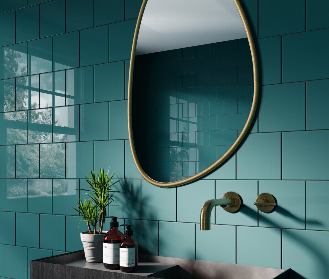
With Summer here, it’s the perfect time to inject some colour and personality into your interiors and there’s no better way to do this then with the Kaleidosoul trend.
Inspired by a modern take on 1970’s multi-cultural Britain and colour palettes, this look is all about blending bold tones and playful patterns with softer shapes and tactile finishes to create spaces that feel warm and easy to live in.
Here, Harriet Goodacre, style and interiors consultant at Topps Tiles, shares her advice on how to bring Kaleidosoul into your own house.
“If you want to transform the look and feel of your home so it’s warm, indulgent and celebrates all things colour and pattern, then Kaleidosoul is the perfect trend. Designed to turn your space into a feast for the eyes, it’s about taking both traditional and multi-cultural influences and blending them with more contemporary touches for an aesthetic that’s joyful, and above all, stylish. That means being brave with colour and embracing bold and dramatic looks, just like we did back in the 1970’s.
“But fear not, this isn’t about reverting to garish colours and an over reliance on carpet everywhere. It’s about welcoming warmth and bold self-expression in our décor and the way that we style our home. So, instead of defaulting to neutrals, which can feel safe, consider building your interiors scheme around one or two richer shades that feel uplifting. Deep green, opulent jewel tones, spicy orange or warm yellow, all work especially well for this look, and embracing complementary shades is the key to pulling it off successfully.
“If you’re not sure how to create a colourful scheme then start small. For example, a chequered splashback in harmonious, warm tones can add a subtle retro feel to a kitchen but with a fresh, modern nod. In bathrooms and kitchens, repeating floral or geometric motifs can create a strong focal point when paired with simpler, more contemporary finishes and accessories elsewhere.
“And if you’re a fan of a maximalist style, then consider using a single bold shade across all your walls and even woodwork and furniture. It’s a great way to add depth, especially in rooms where you have good natural light.
“While paint is a great way to do this, tiles create a real point of interest thanks to the array of laying patterns and gloss or matt finishes you can pick from. For example, a basket weave wall tiled in a deep glossy bronze, complete with touches of gold accessories and crisp white furnishings, is a great way to add drama to your home and bring a wall, and a room, to life. But if you’re unsure, start with one statement area and build out from there. Keep the palette consistent, layer in natural materials and warm metallic accents, and let the colour do the work.
“Texture is just as important as colour. Mixing high shine surfaces with matt paint or pairing dramatic marble effects with earthy tones and dark woods, adds interest without making the space feel busy. Fluted or ribbed tiles also complement the curved furniture and softer edges we’re seeing more of this season.
“Above all, have a bit of fun with your interiors. Spring is the season for a reset, and your home should reflect that lighter, brighter mood. Whether you go all in with colour drenching inspired by 70’s tones, or simply introduce a patterned splashback or statement wall, it’s about choosing combinations that make you smile when you walk into the room.”