From Tomato and Scarlet to Cranberry and Damson, interior experts highlight why red is the colour of the season and how to apply it in the home
Plus 3 other ‘shades to watch’ as we head towards 2024!
Red is the colour set to get the our hearts racing this Autumn/ Winter according to trend forecasters from The Rug Seller and Arighi Bianchi who shine a light on the varying shades of red that are set to dominate home decor as we head into the new season.
Lucy Mather, interiors expert from Arighi Bianchi says, “Where fashion leads, interiors often quickly follow and, with the Barbie pink trend now at saturation point, it is scarlet that is the hue on everyone’s lips this Autumn.
“Red came through on the fashion runways of the 2023 haute couture shows, with scarlet featured by designers from Stella McCartney, Victoria Beckham, Alexander McQueen and Prada, to name just a few. And it is now quickly gaining momentum in interiors too.
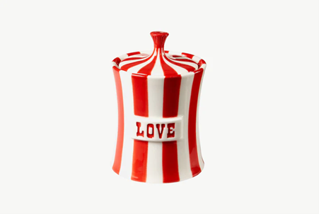
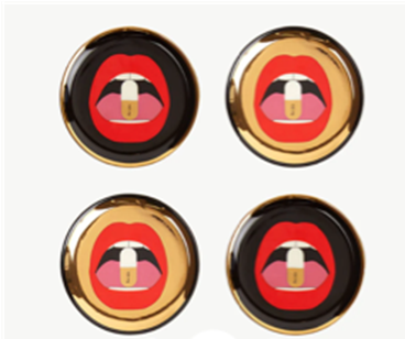
“In the main we’re seeing red being applied using home accessories – the designer Jonathan Adler range has lots of it. Adding colour popping home accessories that introduce the red interiors trend is a safe way to give it a go.
“And if we’ve learnt anything about interiors in 2023 then it’s that we enjoy having fun with our colour choice – expressing our personality and not taking ourselves too seriously. Red is a joyful and playful colour that you can really have fun with.”

Accessories by Jonathan Adler available at ArighiBianchi.co.uk
Daniel Prendergast, design director at The Rug Seller, says: “The popularity of red could be down to the fact that the dopamine decorating trend is still popular for interior styling, especially as we move into the winter season.
“Shades of red are intrinsically linked with positive cues of Autumn/Winter (think holly berries, cranberries, robins and Father Christmas), but they also bring joy and brightness into our homes which is something we very much craving at this time of year.
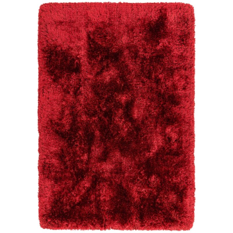
“For those looking to make a bold colour statement we are seeing vivid floral inspired reds gaining traction in wall coverings, cushions and rugs.
“If these vivid shades are a bit of a step too far for you then don’t despair. The beauty of red is that there are so many variations to this shade – with versatile pink and purply red hues very much on trend for the season ahead too.”
Red Variations: Crushing on Cranberry & Damson Delight
 “One of my favourite takes on the red interiors trend is cranberry”, says Daniel Prendergast, design director at The Rug Seller. “Cranberry is an uplifting and feel-good shade. It’s strong, optimistic and cosy – making it the perfect colour for the changing season. It is less harsh than a vibrant scarlet red, yet a step away from the pink hues that have been trending in recent months. It also pairs perfectly with lots of different neutrals; making it a more versatile shade than you might think. What is more, these nature inspired shades of red really marry in to our current obsession with natural and biophilic inspired influences.
“The best way to embrace this trend is to use it as a focal point for a pop of colour using accessories such as a rug, cushions, lampshades, artwork and bedding. If you want a more subtle look then choose a patterned or abstract design which will break up the block of colour even more. For example, an abstract rug with hues of cranberry will look stylish and have longevity.
“Bedding is another flexible way to add red to your interiors. Opt for toned down reds or mix it up with patterns to avoid it being too overwhelming. Red is an emotive colour and not the most restful shade for the bedroom.”
“Damson is another shade we are set to see a lot of this Autumn/Winter”, says Lucy Mather, interiors expert from Arighi Bianchi. “A red with purple undertones, we’re seeing damson being used to create a luxe finish to interiors with the use of tactile fabrics and the pairing of damson with red to layer together jewel-like tones for depth and tactility. We expect this combination to be popular this season.
“Bold without being overpowering, damson is full or warmth and richness making it the ideal shade to go all out and colour drench a room. Again, look for ways that you can add tactility and depth if you are going for a block of colour. Fabric panelling is the perfect way to create that luxe cocooning space.”
3 other shades to watch: Cracked Pepper, Forest Green and Pale Khaki

“The Quiet Luxury trend which is really coming through in interiors for A/W 2023 is really driving the trends in neutrals and classic colours,” says Lucy.
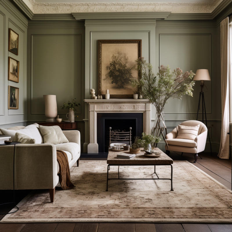
“These shades are rich and sumptuous with a timeless elegance. Think the neutrals that have been trending for some time but with warmer tones and a richness to them. They are unobtrusive and paired back with a less is more ethos. My favourite new neutral shade that is coming through for this season is warm khaki, which is a new take on beige. Pale khaki is the richer, warmer and more refined best friend of beige. With its tan undertones it is a calming and restful neutral that is perfect for paired back interior lovers looking to add some refined luxury to their space. Because it’s a warm colour it works particularly well in large rooms.
“This is a classic base shade that can be used at scale as part of a tonal colour palette. Or use it as a backdrop to add in vivid pops of colour such as turquoise and blush pink.”
“Thanks to the enduring influence of biophilia on home interiors, shades of green have been infiltrating colour trend predictions for a good few years”, says Daniel Prendergast. “For A/W 2023, it’s a palette of rich forest greens that are set to become new design classics. Shades will vary from a lighter leafy green to a deeper khaki. Treat this shade as a neutral. Don’t be afraid to go big and build your scheme around it. Embrace its comforting and cocooning warmth. Layer shades of green together for a tonal look or pair with creamy off-whites.
“And finally, my other prediction is a hue that was chosen as a Colour Of The Year by US brands Behr and Home Depot, Cracked Pepper. This soft black is described as a bold and moody paint colour that offers endless expression for every style – and I agree I love this shade applied to walls, large rugs and bedding.”

